- 2-D animation
- 3-D animation
- Abstract
- Abstract Painting
- Alt. process photography
- Animation
- Architect
- Archivist
- Art History
- Arts Writer
- BFA
- Blacksmith
- Book arts
- Book Illustration
- Branding
- Calligraphy
- Caricature
- Carpentry
- Ceramic
- Collaborative/collective
- Collage
- Color Photography
- Comics
- Commercial Photography
- Commission
- Community art
- Concept Art
- Conceptual
- Construction
- Copy photography
- Curator
- Development
- Digital 3-D modeling
- Digital Fabrication
- Digital Media
- Digital Photography
- Documentary
- Eco-Art
- Editor
- Editorial photography
- Engraving
- Etching
- Event photography
- Fab Lab
- Fashion
- Feminist
- Fiber
- Fiber Art
- Figure
- Film
- Film Photography
- Freelance
- Furniture Design
- Gallerist
- Game developer
- Garments
- Gender
- Goldsmith
- Graphic design
- Health and medical
- Home furnishing
- Identity Design
- Illustration
- Installation
- Interactive
- Interior Design
- Interior Painting
- Jewelry
- Kinetic
- Landscape
- Landscape Architect
- Lettering
- Letterpress
- Logo Design
- Master Printer
- Mechanical drawing
- Metal Fabrication
- Metalsmithing
- MFA
- Miniature
- Model
- Model maker
- Monotype
- Mural
- Mural Artist
- Music
- Packaging Design
- Painting
- Performance art
- Photography
- Porcelain
- Portrait
- Portraiture
- Preparator/ Art Handler
- Printmaking
- Product Design
- Public Art
- Public Engagement
- Representational
- Restoration
- Robotics
- Screenprinting
- Sculptor
- Sculpture
- Sign painter
- Social media
- Social Practice
- Soft Sculpture
- Stone
- Stop Motion Animation
- Street Art
- Surface Design
- Teaching artist
- Textile
- UI Design
- Video
- Visual Identity
- Web Design
- Wedding photography
- Window display
- Woodcut
- Woodworking
- Writer
Corey Templeton Photography
Connect me with Sabrina Volante
X


Description
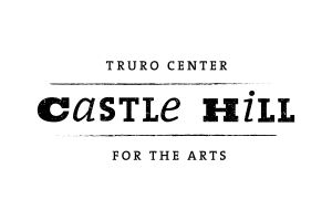
For this logo I wanted to create something that would appeal to a large audience of people. In order to create a strong logo that had appeal to both senior citizens and teenagers I tried to combine typefaces that had a strong/relaxed feel. The circle with the initials "CT" can be separated and used on it's own when needed, such as a website icon or profile picture.
Other Projects by Sabrina Volante
https://portfolio.meca.edu/
https://portfolio.meca.edu/

